Unsupervised Learning Method Series — Exploring K-Means Clustering
Let’s explore one of the most famous unsupervised learning methods and how it uses distances to map similar instances together


Unsupervised learning is a misterious, yet fun, art. While there is no ground truth label to predict and it may be harder to evaluate the solution we come up with, unsupervised learning methods are extremely interesting techniques to understand our data’s structure and reduce it’s complexity.
Along with visualization and dimensionality reduction techniques, clustering is an important group of unsupervised machine learning methods that help us collapse single instances into fewer examples by losing some of the original signal from our data. In this unsupervised learning series, we’ll first approach k-means clustering, a very interesting and famous distance-based clustering method.
K-means Algorithm
The K-means algorithm works by mapping every observation to a fixed number (k) of clusters in a dataset based on distances.
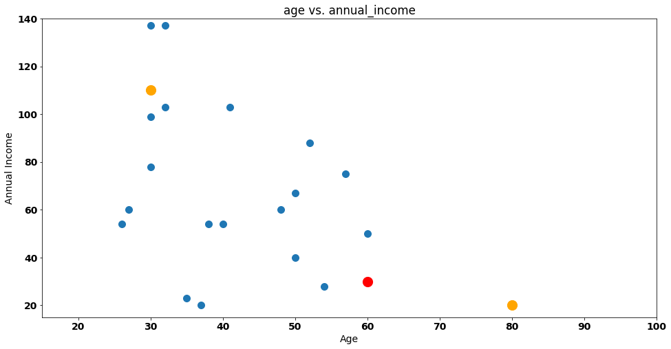
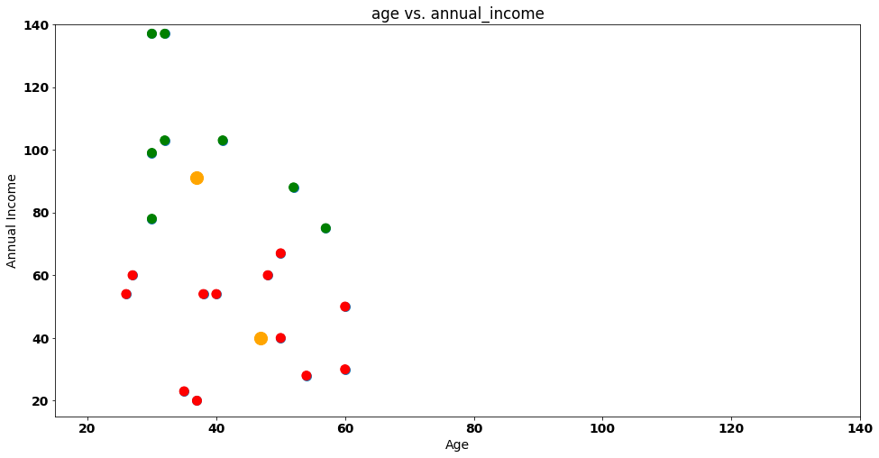
Let’s start by visualizing an example where we have customers mapped on a 2 dimensional plot by Ageand Annual Income:
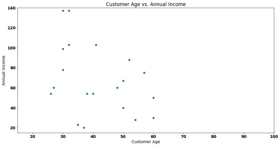
If we needed to group the customers of our fictional shop (each customer is a dot), how many distinct groups should we choose, given that there is no definitive labeling system for these groups?
To answer these questions, we will first conduct some experiments. Our initial assumption is that there are 2 distinct groups, and we need to allocate our customers to them.
To begin with, we will randomly select two points on the plot, which will serve as cluster centroids (representing the center of our groups). These points are highlighted in orange for ease of identification:
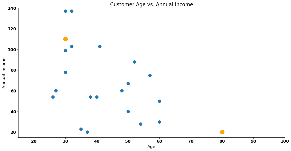
The number of orange points are considered the k of k-means. Our solution is awful. Why? Because the orange points fail to represent the underlying data. We have a centroid (bottom left corner) that is just too far away from the data. How can we improve this?
The first step of k-means consists of allocating every data point to the nearest centroid. In our case, every customer will be considered part of one of the orange dots we see in the picture.
To make this even easier to understand, let’s start by naming one of our points — customer Steve!
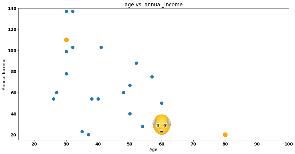
Steve is a bit confused — he doesn’t know which group he should join. Should he join the group on the bottom right corner (represented by the orange dot) or the one on the top left corner (represented by the other orange dot)?
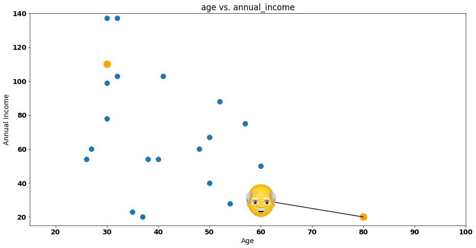
Let’s give a helping hand to Steve, by drawing the distance between itself and each group:
One easy way to represent this distance is by calculating the euclidean distance between Steve and the group, something that is represented by the following formula:

If we substitute P1 and P2 by Steve and the cluster centroid, we have the following calculation:

The distance of Steve to Centroid 1 is 22.36. What about the distance from Steve to Centroid 2?

In this case, the distance is:

Steve is clearly nearer Group 1 (or Centroid 1) according to the euclidean distance, so he’ll get assigned to that group — let’s do that by painting the dot representing Steve with a red column:
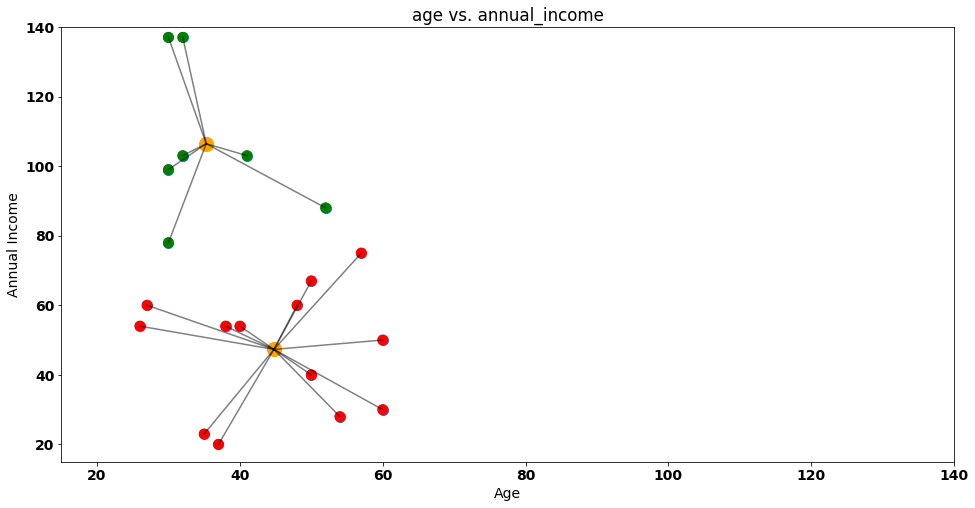
If we repeat the same process for all other customers the result will be the following:
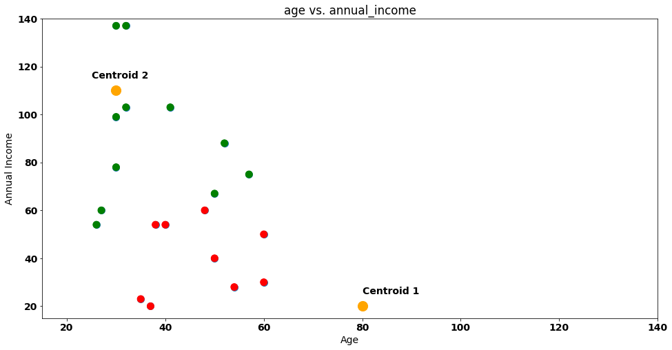
In the figure above, we mark customers that are near Centroid 1 as red (just like Steve) and the ones that are near Centroid 2 as green.
Is our clustering solution done? Nope!
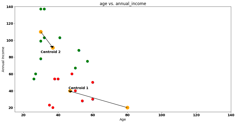
The next phase of k-means is to recalculate the centroids (orange dots). How can we do that? We just compute the average of the points assigned to each cluster!
In this case:
Average of all
Agesassigned to Centroid 1 is 46.9. Average of allAnnual Incomefor this group is 39.9.Average of all
Agesfor Centroid 2 is 37. Average of allAnnual Incomefor this group is 91.
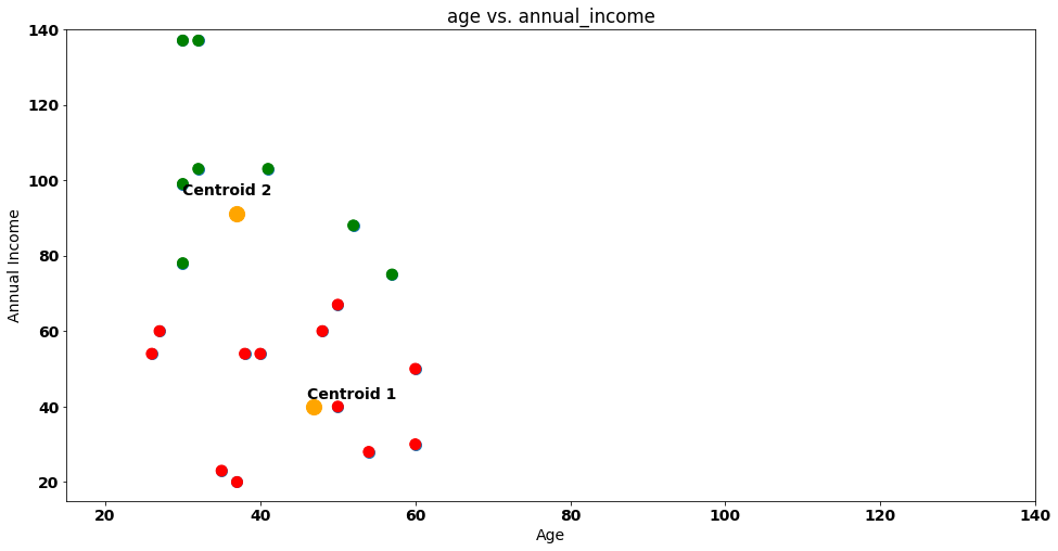
The coordinates (46.9, 39.9) and (37, 91) will be our new centroids! Let’s move them in our 2-D plot:
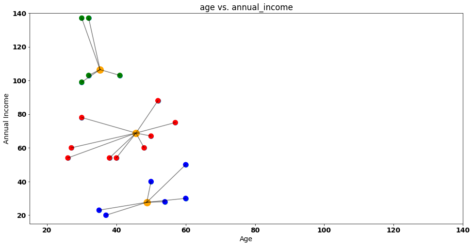
With the new centroids on our plot, we reset the attribution of customers to clusters. Steve and friends will have to be allocated again!
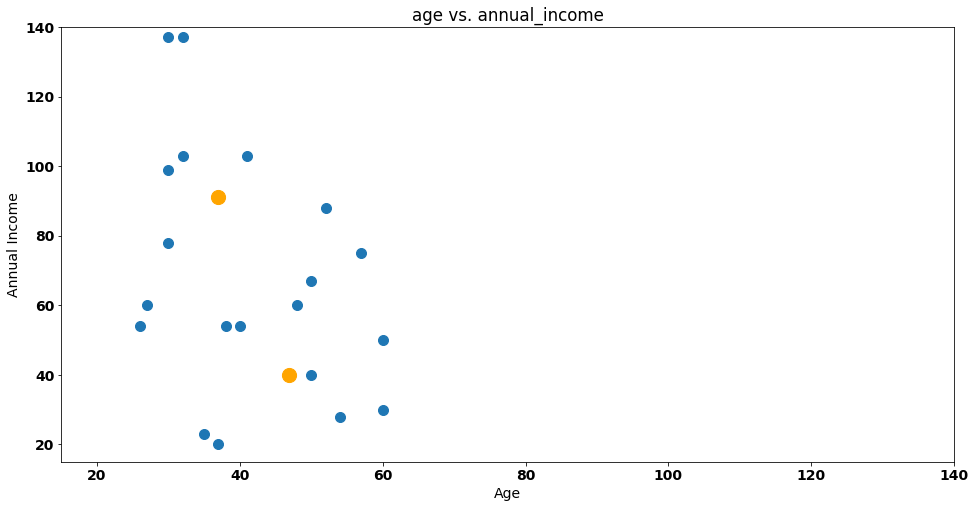
We calculate the euclidean distance between each data point and centroids again — after doing that, we’ll have new groups:
Notice that something changed between our first and second iteration! Let’s visualize our iterations again next to each other.
Iteration 1:
Iteration 2:
Some customers moved from Group 1 to Group 2 between iterations — namely the purple points highlighted below:
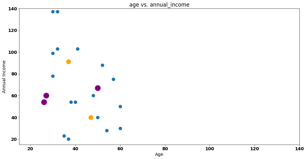
This is a central theme in k-means clustering as the process will stop when no points change cluster from iteration to iteration.
In our case, two iterations are enough as no customer will change it’s group in the next iteration — k-means complete!
After performing a clustering grouping, we will treat our data as two single data points , represented by the centroids!
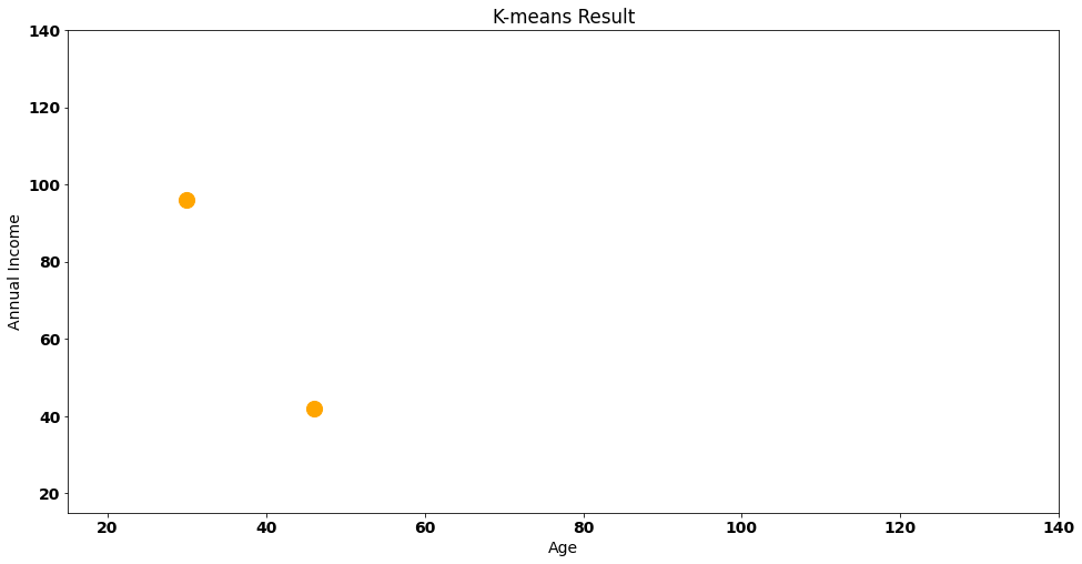
This is a very important step — we are making the active choice of reducing our data points to only 2. This is a significant loss of variance of the data and one of the core ideas behind of clustering.
How can we evaluate this solution? One idea is to compute the within clusters sum of squares, a metric that calculates the distance between each data point and it’s corresponding cluster — visually:
If we compute all the euclidean distances between our points and their respective centroid, we will get a value of around 8850 — this value gives us translates into the information we are losing by considering our customers as two clusters. Additionally, we can also check the Between Cluster Sum of Squares(bcss) that measures the average squared distance between all centroids.
Naturally, when we add a new centroid, the WCSS will be lower, as points will have to travel less to their centroid:
With the k-means intuition in our pocket, we can check the sklearn implementation in Python. Additionally, we still don’t know how to evaluate an appropriate number of clusters (k) — something we will see next!
Sklearn Implementation
In this part we’ll use the The Airlines Customer Satisfaction dataset, that contains information about customer satisfaction for an airline company. Each observation represents a customer, and the variables include things like the customer’s demographic information, the travel type (business, etc.), and their satisfaction ratings for various aspects of the flight.
Here’s a look at the first 5 rows and 13 columns of the data:
airline_data = pd.read_csv('/content/data/airline.csv')
airline_data.head(5)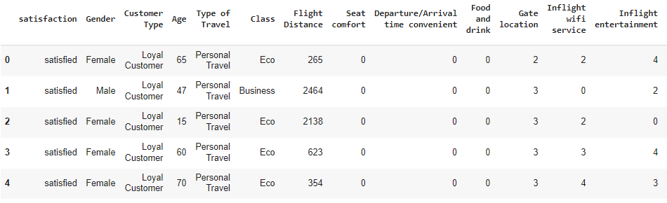
Starting our pipeline with preprocessing let’s remove some columns that we don’t want to influence our clusters — for that purpose, I’ll remove all categorical columns from a possible solution:
Satisfaction;
Gender;
Customer Type;
Class;
Type of Travel;
Naturally, this is a choice that I’m doing in the data pipeline, for two reasons:
I want to keep the focus of this blog post on explaining k-means, and avoid building a more complex data pipeline that takes away our attention from that purpose.
When it comes to categorical variables, we don’t want to have too many dummy variables influencing our clusters.
As we add more and more binary (also called dummy) variables into the k-means solution, these variables start to weight a lot in the final clustering distances, even after standardization, so it’s very important to be cautious when adding this types of data to any k-means solution.
airline_data_filter = airline_data.drop([‘satisfaction’, ‘Gender’, ‘Customer Type’, ‘Class’, ‘Type of Travel’], axis=1)I also noticed that there are 393 rows with Arrival Delay in Minutes as NA — k-means implementation will not deal very well with this, so we need to do some data imputation.
If we zoom-in on these rows, no pattern emerges:
airline_data_filter.loc[airline_data_filter[‘Arrival Delay in Minutes’].isna()]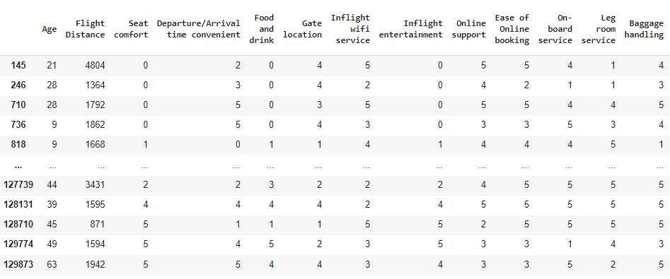
For these rows, I’ll just assume that the plane arrived with the same delay as it departed — applying that rule using np.where:
airline_data_filter['Arrival Delay in Minutes'] = np.where(
    airline_data_filter['Arrival Delay in Minutes'].isna(),
    airline_data_filter['Departure Delay in Minutes'],
    airline_data_filter['Arrival Delay in Minutes']
)
The rule is quite simple and we are leaning on np.where to do this:
When
Arrival Delay in Minutesisna, we say that this column should be equal to theDeparture Delay in Minutes, otherwise we use the original value.
Next step in the preprocessing pipeline is to standardize all our variables into a common scale. Particularly in k-means, where distances are a crucial part of the algorithm, this step may be extremely important to find meaningful customers (although testing without standardization may also give you good results, depending on how the underlying variable distribution behaves and how large the difference in numeric scales).
I’m going to apply a StandardScaler from sklearn :
scaler = StandardScaler()
scaled_airline = scaler.fit_transform(airline_data_filter)
Preprocessing done — we’re ready to fit our k-means solution!
But..
How many centroids do we choose?
Normally, in a k-means solution, we would run the algorithm for different k’s and evaluate each solution WCSS — that’s what we will do below, using KMeans from sklearn, and obtaining the wcss for each one of them (stored in the inertia_ attribute):
from sklearn.cluster import KMeans

wcss = []
for k in range(1, 50):
    print('Now on k {}'.format(k))
    kmeans = KMeans(n_clusters=k, random_state=0).fit(scaled_airline)
    wcss.append(kmeans.inertia_)
We can now visualize the evolution of WCSS per each solution. There are several methods to choose the number of appropriate clusters — in this post, we’ll use the elbow method that chooses the # of clusters where adding the curve below becomes starts to become less steep as this represents the solution where adding a new cluster won’t lower WCSS so much:
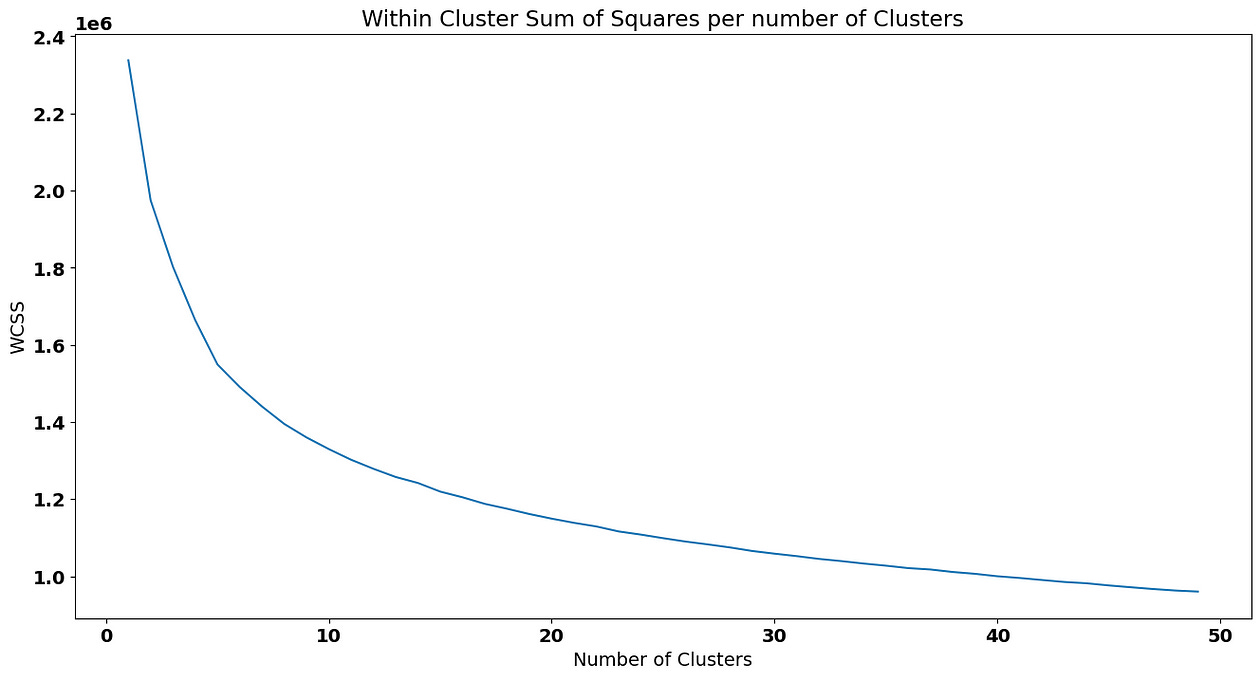
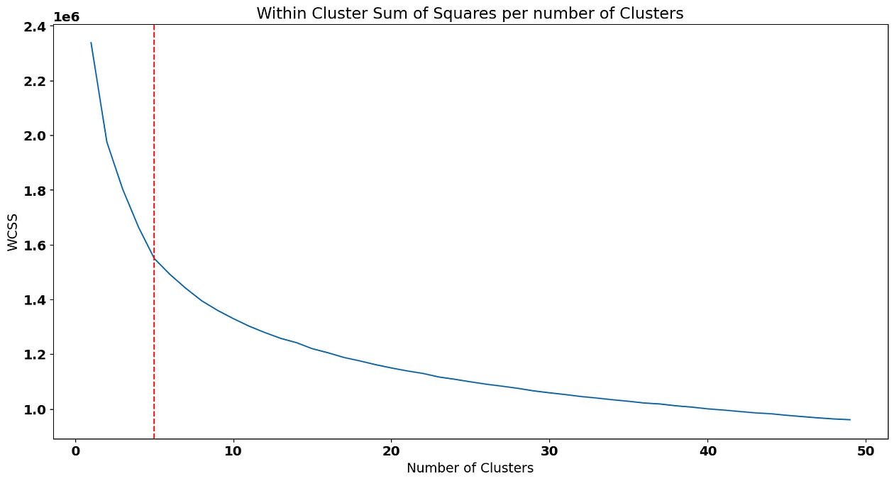
We are going to choose 5 as our ideal number of clusters (keep in mind that choosing a point in the elbow plot is not scientific and it’s actually a good idea to test different solution near the “elbow”):
To fit the solution with 5 clusters, we can pass that value to the parameter in the Kmeans implementation:
kmeans_5 = KMeans(n_clusters=5, random_state=0).fit(scaled_airline)Now, we’ll predict the cluster based on this solution for each customer on our filtered data frame — although we should predict on the scaled_data (as it contains the same scale where the solution was fitted), it’s actually a good idea to add the predictions to the original dataframe so that we are able to interpret the means of the clusters with scales that make sense:
airline_data['cluster_kmeans'] = kmeans.predict(scaled_airline)How do we analyze the clusters? One cool idea is to compare the means of the features across clusters:
airline_data_filter['cluster_kmeans'] = kmeans_5.predict(scaled_airline)To interpret the cluster_kmeans , we just compute the averages accross all variables for each cluster:
airline_data_filter.groupby([‘cluster_kmeans’]).mean()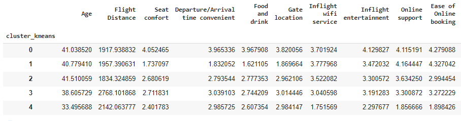
For example, cluster index 1 seem very annoyed with their Seat Comfort as , on average, customers that belong to this group only gave 1.83 points to this variable on the survey. Although we can keep doing these comparisons for all variables, we still have a lot of dimensions (features) on our clustering solution, making it harder to analyze the differences between them.
To remove some features from the clustering solutions, some ideas we can apply are:
Remove or combine highly correlated variables.
Fit a Principal Component Analysis or other dimensionality reduction techniques.
To keep this post light, let’s analyze the correlation matrix between our numeric features:
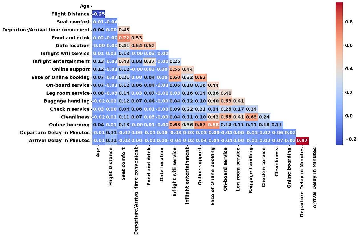
From the correlation matrix above, we can identify that “Online Boarding”, “Inflight Wifi Service”, “Online Support” and “Ease of Online Booking” seem to be correlated together. I’m going to average these 4 variables into a single one called Online and Wi-Fi Satisfaction :
online_cols = ['Online boarding', 'Inflight wifi service', 'Online support', 'Ease of Online booking']

airline_data_filter['Online and Wi-Fi Satisfaction'] = (
    airline_data_filter[online_cols].mean(axis=1)
)

airline_data_filter.drop(columns=online_cols, inplace=True)
Seat Comfort and Food and Drink can also be combined into a “Comfort & Food” variable:
comfort_food = ['Seat comfort', 'Food and drink']

airline_data_filter['Comfort & Food'] = (
    airline_data_filter[comfort_food].mean(axis=1)
)

airline_data_filter.drop(columns=comfort_food, inplace=True)
Finally, I’m going to drop Arrival Delay in Minutes as it has a very high correlation with Departure Delay in Minutes :
airline_data_filter.drop(columns=['Arrival Delay in Minutes'], inplace=True)Also, we’ve already fitted a clustering solution to this dataset, so let me remove that variable as well:
airline_data_filter.drop(columns=[‘cluster_kmeans’], inplace=True)We’re only left with 13 features! K-means solutions may also suffer from the curse of dimensionality (particularly when we try to interpret our clusters) and trying to reduce the dataset features may be a good idea to interpret our clustering solution in a more easy manner.
Let’s see the elbow curve based on the new dataset that contains less features:
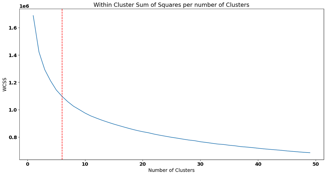
In this case, I’,m going to choose 6 clusters as a solution. Predicting them and adding the new cluster to the airline_data_filter dataset again:
kmeans_6 = KMeans(n_clusters=6, random_state=0).fit(scaled_airline)
airline_data_filter['cluster_kmeans'] = kmeans_6.predict(scaled_airline)
airline_data_filter.groupby(['cluster_kmeans']).mean()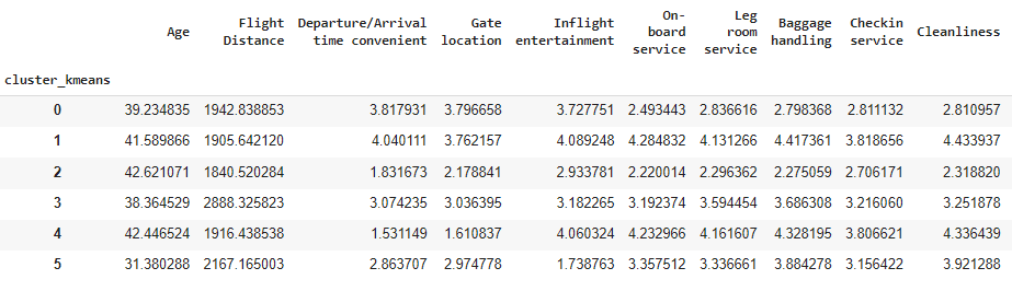
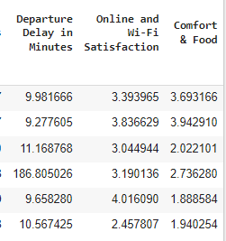
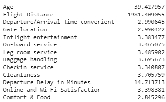
To do a profiling of our customers, it’s relevant to know the average of our features, as well:
Based on the comparison between the average of each variable, we can now do some profilling of our clusters! For example:
Cluster index 0 consists of a group of customers that is on the average of most variables. They do seem a bit unhappy about some parts of the flying experience such as
On-board and Leg room Service,Baggage Handling,Checkin serviceandCleanliness. How do we know that? Because they gave, on average 2.8 points to these variables in the survey, 0.5 p.p below the overall average.Cluster index 1 is made of very happy customers. These customers rated the airline services with above than average points (most variables have an average of above 4 stars for this group of customers).
On the other hand, cluster with index 2 seems very unhappy. These customers rated the airline services with a below than average rating.
Cluster with index 3 consists of customers with longer trips and that rate the airline services a bit below the average. These customers also seem to have been impacted more often by a delay on their flight.
Cluster with index 4 has customers that are generally happy except for three variables:
Departure/Arrival Time Convenience,Gate LocationandComfort & Food. Probably, there’s some extra variable that may justify these ratings, such as these customers travelling low-cost.Cluster with index 5 contains the younger customers. It’s very interesting to check that they rated most of the variables with average points, except for
Inflight Entertainment,Online & Wi-Fi SatisfactionandComfort and Food. Possibly, as these customers are younger, they had different expectations regarding online services and entertainment that were not met by the airline, something that may impact the airline’s ability to captivate younger customers.
As you can see, it’s very easy to set up a clustering solution in Python. Here are some suggestions of next steps that you can do:
Visualize the distribution of the categorical variables inside the clusters.
Check how these clusters relate to customer satisfaction.
Build targeted campaigns to improve customer satisfaction. For example, it seemed that the last cluster was disappointed about the entertainment and online services — why not build a personalized campaign for younger customers offering a better experience on these services?
Conclusion
That’s it! Thank you for taking the time to read this blog post.
Some things we didn’t discuss were limitations of this algorithm. Let’s use this conclusion for that:
One important thing to keep in mind when using k-means is that the algorithm is sensitive to the initial placement of the centroids. This is because the algorithm may converge to a local minimum, rather than the global minimum, if the initial centroids are poorly chosen. Therefore, it is often a good idea to run the algorithm multiple times with different initial centroids and choose the solution that gives the lowest overall sum of squared distances.
Another limitation of k-means is that it assumes that the clusters are roughly spherical and equally sized. This means that it may not work well on datasets where the clusters are irregularly shaped or have vastly different sizes. In such cases, other clustering algorithms may be more appropriate, such as hierarchical clustering or density-based clustering.
Despite its limitations, k-means is a popular and effective clustering algorithm that has been widely used in many different applications. It is relatively easy to implement, explainable and can handle large datasets efficiently. With its simple and intuitive approach, it is a good starting point for exploring the structure of your data and identifying patterns that may not be immediately obvious.
If you would like to drop by my Python courses, feel free to join my free course here (Python For Busy People — Python Introduction in 2 Hours) or a longer 16 hour version (The Complete Python Bootcamp for Beginners). My Python courses are suitable for beginners/mid-level developers and I would love to have you on my class!